Showing posts with label Techniques. Show all posts

Wednesday, October 10, 2012

Stamp-n-doodle Wednesday!!!

Welcome to Stamp-n-doodle Wednesday!!!! This week I am the featured challenge coordinator and I am so excited about it. I chose Wet, or better known as heat embossing on digi images!!! Here is a card that I made with one of the new Halloween images:
Ok, I heard that some of you out there do not understand the challenge or how to do it, so I am adding some instructions here to my post. What I wanted everyone to do was to heat emboss on the actual digi image!!! Sounds strange, I know because when we usually heat emboss we do it with a traditional rubber or clear stamp and an embossing ink pad or Versa Mark Ink pad. There are two ways that you can Heat emboss on a digi image, this is what I did with the card above. I used what is called a versamarker, see photo below:
This marker has the same ink in it that the Versamark Ink pad has. It is a sticky ink that embossing powder sticks to. It has two tips on it, a brush tip and a small tip. You simply color with it on the area that you want to emboss, in my case it was the black cat and I used Clear embossing powder. So, you color the area to be heat embossed, sprinkle on the embossing powder and heat set with a heat gun. Simple as that. Now, if you need more instruction, let me know and I will try to make another one so that I can post step by step pictures. Feel free to leave me a comment and let me know. Maybe Lynne would let me post it on the blog as a tutorial. So let me know if you need more assistance. Now, the other method of heat embossing is the same as if you used a stamped image, you would simply stamp a versamark ink pad directly on the entire image after you have colored it and cut it out, and then add your embossing powder, heat set with your heat tool, and you are finished. You can do this with 3 or 4 layers if you like, put it into the freezer to dry, then bend it little to create cracks and give it an antique look. Use Clear Embossing powder for this method as well. Now, if you are very curious, DT member Jacki, used the second method on her card this week with the cardinal image and it is absolutely gorgeous with great photos, so go check it out! Go visit the other DT lady's blogs and see what wonderful creations they have made to inspire you. Until next time..........Blessings, Lisa

Tuesday, January 19, 2010

Valentine Cards Stampin Up Style

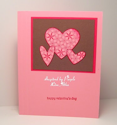
Hello. Back again as promised. What I did for these Valentine cards was to first stamp some Backgrounds with Melon Mambo Ink onto Pretty in Pink card stock. First I stamped with two stamps from the Stampin Up "Park Avenue Patterns" stamp set, then I stamped with the "Medallion" stamp. On the Medallion stamp I also used the "Thumping" technique with a Rich Razzleberry Marker. Thumping is to simply tap the brush tip of your marker onto the stamp after you have inked it with an ink pad. Obviously using two different colors. Then, I punched out various heart shapes out of these backgrounds with Stampin Up "Full Heart Punch", and the "Heart to Heart" punch. After doing this, you have a bunch of fancy hearts to arrange on cards. I came up with seven cards, all the same layout, but with different patterns on each ones hearts. The patterns don't even have to cover the whole heart shape, they look very interesting either way. So, here are how mine turned out: Feel free to click on each one to enlarge it and get a better view.
Park Avenue Patterns used on this one, and edges of hearts brushed slightly on the Melon Mambo ink pad.
Same on this one, plus a small heart added with the new SU small heart punch.


Ditto on this one.


Medallion background stamp used on this one.


Medallion used on this one too. Can you see the Rich Razzleberry accents from the "Thumping" technique on this one?
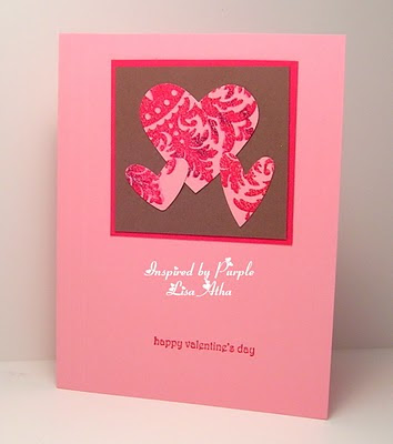

Same comments on this one as the previous above.

Same comments again on this last card.
I am not sure if you could see them, but I also put two score lines on the left side of the card to add some interest. The card stock colors used were Pretty in Pink, Close to Cocoa, and Melon Mambo. The sentiment on them is from the Stampin Up set called "Teeny Tiny Wishes". If you have any questions leave me a comment that I can respond to.

Until next time.........Blessings, Lisa


Wednesday, September 30, 2009

Ornament Suspension Card

Sorry for my absence, I have been a tad bit under the weather for the past few days. Some extra sleep has been helping tremendously though.


I decided to post a technique that I have never posted before and that is a suspension card or rather in my case a double suspension card. Here it is:
I stamped one of the ornament stamps from the Delightful Decorations stamp set from the Stampin Up Holiday Mini Catalog. I stamped it two times with Rose Red ink, then punched it out with the coordinating ornament paper punch. Then, I punched a circle out of the center of both ornaments at the same time so that the circles line up afterwards. This was easier because I applied a very small amount of removable adhesive to the ornaments and placed them back to back before trying to punch the circles out of them. Next, I stamped one of the smaller stamps of the same set with Certainly Celery ink two times, and I hand cut those out because I couldn't find the correct size circle punch (I have got to organize my punch collection). Next, I applied some permanent adhesive (terrifically tacky tape works best) to all of the backs of the pieces that I wanted to suspend on the string. I used some retired gold cord from Stampin Up for mine, the Tutorial over on the Splitcoast Stampers Website, suggests dental floss. Click here for a link to their tutorial. Next, I laid my gold cord to the back center of one of each of my items to be suspended, then carefully lined up the other pieces on top of those. Then I laid this across the front card base which I had already punched a larger circle into. The final step was to place a piece of designer paper; I used some Retired SU Certainly Celery patterned paper here. As a final touch, I took one of the circles that I had punched out of the ornament center, cut it into fourths, and applied each one to each of the four corners on the front of the card for en extra embellishment. I added an enlarged photo of the card below to show you the suspended items better.


Well, I hope you liked it, and go check out the tutorial on Splitcoast, they added more photos that I did. Until next time................Blessings, Lisa

Wednesday, September 9, 2009

Fall card

Hello. I have a Fall card to share with you today. If you have been following my blog for awhile, you will know that one of my favorite techniques is heat embossing a dry embossed image. This card is using that very technique:

I used a brass template that I bought years ago when I was first experimenting with dry embossing. So I apologize, but I don't know where I found this cute little pumpkin gem. So, I dry embossed the image onto some Stampin Up Whisper White Card Stock, colored the image with my Stampin Up Markers, then colored the raised image again with my Versamarker, and heat embossed with some clear embossing powder. I mounted it onto some Pumpkin Pie SU card stock. The other piece of card stock is simply a piece of Whisper White card stock sponged with Pumpkin Pie ink. I didn't have any DSP that I liked, so I created my own. I placed the whole thing onto Garden Green card base, and added a small sentiment and some DCWV buttons for embellishment. I hope you like it. Until next time..............Blessings, Lisa

Friday, August 14, 2009

Stampin Up Lattice Die & Stamp Convention Tutorial

I am combining several different things here today! First I wanted to show you something using my new SU/Sizzix Lattice BigShot die, an idea for card stock scraps, and also a technique that I saw at the stamp convention that I went to last weekend. I was looking around at a booth at the convention and the lady at the booth began a demonstration on how to add some dimension to flowers that we punch from card stock. She had stamps and punches and instructions put into kits that she was selling. But instead of buying them, I just watched her demonstration thinking that I could do it at home with what tools that I already owned. So, I decided to just dig right in and make a card using her technique. Here is what I came up with:
I first cut out a lattice die with my Cuttlebug and the new Lattice die-cut that Stampin Up introduced in their new catalog. Then I adhered it to my Kraft card stock base. I added my sentiment (from SU - Trendy Trees stamp set), and punched with the Stampin Up Word Window Punch. Then I went to work on the flowers. You will see in the photo below that I punched a bunch of Small flowers with my SU Trio Flower punch out of card stock scraps. This is me preaching that "save your scraps" thing again.
This is the pile of flowers that I ended up with after I punched all that I could with my small scraps of card stock. Aren't they pretty? I then store them in a plastic container until I need them. If you really want to get obsessive, Stampin Up sells an organizer and round /flat containers to store stuff in, you can store them by color group or however you like. There is a link to their catalog on my sidebar, the storage stuff is towards the back of the catalog.
Now, if you look closely at the finished card above you will see that the flowers have a 3-dimensional look instead of being flat like they are when you first punch them. The photo below shows how I achieved the dimensional look. I simply took my embossing stylus, and each flower and rubbed them on a soft surface (I used the sponge side of Bigz Daisies #2 die here) in a circular motion, until they have a sort of cup like look to them. I then adhered them to the card with a small drop of Stampin Up Crystal Effects. The final touch was to punch some 1/8" circles and add them to the flower centers with a very small dab of CE again. Crystal effects dries clear, so don't worry if you get a little too much on the center. Oh, and yes, I definitely used a pair of tweezers to work with these little pieces. Here is a list of card stock colors that I used for the flowers and their centers: Almost Amethyst, Lavender Lace, Lovely Lilac, Pretty in Pink, Regal Rose, Crushed Curry.

I hope that I explained it so that it is easy to understand, but if you have any questions, feel free to ask me. Leave a comment, or go directly to my email (link on sidebar).

Until next time.......................................Blessings, Lisa

Tuesday, August 4, 2009

Fall cards already?

Well, I have been a very busy lady, and haven't had time to make some new cards, so I thought I would share a card that I made last winter and was planning on saving to share with you once summer was over. Oh well, what does it matter what season we are in. I have already started making Christmas cards. Yes, you read that right, Christmas cards. This is the first time I am a few steps ahead on that yearly adventure! I even shocked myself.

Ok, this design was created with a brass template that I bought at Hobby Lobby several years ago. So, I dry embossed the pattern onto some Stampin Up Whisper White card stock, colored the raised areas with Stampin Up markers, then colored the raised areas again with my Versamarker and sprinkled some clear embossing powder on it and heat set. So I heat embossed my dry embossed design. It takes a bit of time, but if you like to color, and like to heat emboss, you would really like the finished product when you are finished. The sentiment is stamped with a stamp that I absolutely can't remember anything about. Sorry about that. The sticky gems are from Michael's, the leaf border at the bottom is a fiskers border punch. Last but not least all card stock is from Stampin Up. Feel free to double click on the picture to get a closer look at the embossing details. Until next time............ Blessings, Lisa
Card stock: More Mustard, Old Olive, and Whisper White.

Monday, July 27, 2009

Watercoloring with Stampin Up Supplies

Hello. Sorry I am so late posting today, since it is almost dark out here in good ole' Ohio. Better late than never. Lately, I have been really into Clean and Simple cards. I have no idea why, but it is what it is. Tonight is no exception. I took a stamp from one of my sets from The Greeting Farm stamp company and did some detailed water coloring, then cut the image out and placed it on a very simple card base. Water coloring is very therapeutic mentally, it relaxes me, and makes me smile. It really isn't hard once you get the hang of it, and use the right tools. Stampin Up happens to have some awesome coloring tools to work with. So first here is the card, then I will provide some instruction.


Feel free to double click on the photo to enlarge it and see the detail of the water coloring. I was frustrated with the way my water coloring looked, so I did some digging and found some instructions somewhere on the Internet. We are so fortunate to have so many paper crafters that blog and are nice enough to show us how to do things. I do apologize, but I can't remember where I saw and read about water coloring. I do invite you to visit the Website and blog link for The Greeting Farm stamp company, as the owner always has some beautiful samples posted on weekdays that her design team has made and they are excellent examples of awesome water coloring. Just click on the store name above, I attached a link to take you right to their store.

Anyways, I use a variety of Stampin Up products and tools when I am coloring a stamped image. I always make sure that I have the following on my table or nearby when I color: Stampin Up Classic Ink pads and refills, SU Watercolor Wonder Crayons, SU Blender Pens and Aqua Painters, Sponge Daubers, Watercolor Paper (cold-pressed 140lb), old wash cloth, and scrap paper of any kind.

What I have learned is to start out with a light color, and gradually color with the darker hues. For instance, if you look at my flower centers above you will notice that the centers appear lighter than the edges. Same thing with the flower petals and leaves. For instance, when I went to color the flower petals, I got out all of my Yellows, tested them in a row next to each other on my scrap paper to see which ones would look best together, then started coloring with the lightest of them, working my way outward to the darkest. I know it sounds intimidating, because it did to me at first. However, the more you practice, the easier it gets and the better your outlined images will look on your cards. I still don't think of myself as an expert on this, I just wanted to share with you, what I do know. I hope I have inspired you to give water coloring a try. The old wash cloth, is for when you get a little too much color or moisture on your blending pen or more specifically your Aqua painter. This brings me to a tip about Aqua painters, a little water, goes a long way. There is no need to fill them up all the way, because then you will have more water than color. Now if you are coloring a sky background that you want really soft looking, then more moisture can be good. The whole thing is a lot of trial and error. I hope however that I have provided you with a good starting point. If you have any questions feel free to email me (see my side bar) or leave a comment. Of course if you need any supplies or tools from Stampin Up, I can help you out there as well. Don't forget to check Stampin Up's web site, to see what their deal of the week is this week! Also, don't forget to click on over to The Greeting Farm's website and blog to see the great colored samples.

Until next time................................Blessings, Lisa

Saturday, July 25, 2009

Stamping on Patterned Paper

is something that I rarely do, and I have no idea why, because it looks really cool. I think that we all get into that same stamping habit, to stamp on white card stock, always white card stock. Think about it, what color card stock do you run out of the quickest? Me.....white of course. Try to challenge yourself sometime, to not use any white or vanilla card stock on a card. That is a definite challenge, especially if you are using stamps. Anyone can come up with a "no stamps used" card without using white or vanilla. Anyways, I used some simple ideas...........three to be exact to show you today. The first card has the same layout that my color challenge post from the other day has. The difference, is that I stamped on some DSP. Here they are:


I used the bird stamp from the Stampin Up stamp set called "Bird on a Branch" to stamp on the coordinating Designer Series Paper called "Flock Together". The paper that I chose had alot of turquoise in it, so I stamped on it with Taken with Teal craft ink. I think if you try to stamp on DSP with SU classic ink, it will smear, due to the water base of the ink and the slick coating on the paper. Anyways, as you can see I used the Full Heart punch to punch out the bird .

The second card, I did the exact same thing, except that I punched out the bird with a square punch, and arranged them on the card slightly different.


The third card, I decided to do very little stamping. The sentiment is from the Trendy Trees stamp set, and is stamped with Night of Navy Classic ink. The hearts were punched out of the same paper from the pack "Flock Together". The two different hearts are the pattern on the reverse side of the turquoise hearts. I love two sided paper. The base of this card as I am sure that you noticed is Very Vanilla, unlike the first two which were Whisper White. See, there is that Whisper White again. So hard to avoid. The panel that the hearts are adhered to is Night of Navy card stock.


That sums up my shares for today, I hope you saw something that you liked. I have out of town family member to see Sunday afternoon, so I will be back to blogging on Monday. I already have something ready to share with you. Until then.......Blessings, Lisa


P.S. Sorry about the position of my name watermark, I am dealing with some photo software kinks. I think there are Gremlins in it, but I have no proof.


Monday, July 6, 2009

Kitty Stencil Card

Hello. What a busy day I had today, I have had no time to stamp. Bummer. However, I have a card ready that I am sending to my mother-in-law for her birthday. I have always tried to find ways to use my brass stencils for something other than just dry embossing, and that is what I decided to do for this card. My mother-in-law is very fond of cats, so here is what I came up with:


Sorry about the photo quality, I had no natural light to work with. Anyways, I have no idea where I got this brass stencil, I have had it for several years. Anyways, I sponged some ink with the stencil instead of dry embossing. Then, I added some Stampin Up Crystal Effects to the kitty and her window. When that dried, I decided to add some stickles to the dangling toy and the white space surrounding the kitty. Of course all of this can barely be seen in the photo. It just was not my day I guess. The pretty trim under the cat was made with my Martha Stewart Double Arch Border Punch, and the matting for the cat was cut with one of my Rectangle Nestibilities. The dry embossing on the far right was done with one of the cuttlebug border embossing folders and my Scor Pal made the straight line embossed near the floral border. All of the card stock and ink used is from Stampin Up and until next time.............Blessings Lisa

Wednesday, June 24, 2009

More Ocean Commotion and Sponging

I was originally going to put the image that you will see today on yesterday's mosaic card, but was afraid that it was too big and would cover too much of the mosaic pattern that I worked so hard on. So, I worked out another layout for this stamped image:


Ok, the very first thing that I did was to cut out a rectangle with my Spellbinder's Nestibilities Rectangle die-cuts. Boy do I wish Stampin Up would carry these things, but then that catalog is so full already. Anyways, I left the card stock in the die-cut, and then stamped along all of the four sides of the rectangle with the water swish stamp form the Ocean Commotion stamp set, and my Versamark ink pad. Then, I added clear embossing powder to the swishes, and heat set.

Next, I stamped and heat embossed two Sea Horses from Ocean Commotion. Then, I got out my stamping sponges, and my Night of Navy and Ballet Blue ink pads, and started sponging some ink onto the edges heavily and the center very lightly, until I had achieved the look that I had envisioned. Then, I wiped the ink off of the swishes with a tissue. Next I added the sentiment from SU's Retired "Warmest Regards" onto a tag, added a bit of ribbon to the tag and a blue Rhinestone brad from Stampin Up, and adhered that to the card.

The final thing that I did was to adhere some ribbon scraps and brads for a little embellishment.

The next time I will have something prepared with some of the new stuff from the upcoming Stampin Up 2009-2010 catalog. New stamps, new in-colors, I can't wait to play with my new stuff that arrived today! Until then, Blessings to all. Lisa

Faux Mosaic Fish

I saw an interesting technique on Splitcoast awhile back and have been wanting to give it a try. It is called Faux Mosaic, and it allows me to use some card stock scraps that I save in my altered heart box (see category list on the side bar for that one). I have this habit of saving absolutely anything that I think may be useful, yes I am a "pack rat", tis inbred in my immigrant genes on both sides of my family. Anyways, here is the card, and I used the stamp set "Ocean Commotion" from Stampin Up.


Here is a photo of just the mosaic pattern:


I think the easiest thing would be to just list by number the steps involved in making this:

  1. The first thing that I did was to gather scraps out of my box that were all in the cool blue colors. On this card I used Night of Navy, Ballet Blue, Bashful Blue, and even a few of the retired Bliss Blue all from Stampin Up.
  2. Next, I cut the ones whose shape that I didn't like.
  3. After that, I cut a base for the mosaic to a size that I liked.
  4. I cut a piece of Stampin Up's double sided sticky sheets to the size of my card stock base, and adhered it. Remove one side of protective sheet, lay it on the card stock, smooth it out, then remove the other side to expose the other sticky side.
  5. Place card stock scraps onto sticky sheet in any random positions that you like, leaving space between each one.
  6. Sprinkle embossing powder over entire mosaic piece. Shake off excess, and heat set. I chose to use silver EP here.
  7. Take your Versamark pad and apply it to the mosaic piece directly over and over until the entire piece is covered.
  8. Sprinkle clear embossing powder over entire mosaic piece, shaking of the excess.
  9. Heat set. That part is done.

Now for my Fish image! I stamped the image onto my Versamark pad, then onto an SU Ballet Blue ink pad, then kind of rolled the edges of the stamp on a Classic Night of Navy ink pad. I got a little more Navy on here than I wanted, but oh well. This part is called the "Rock and Roll" technique. Isn't that just like me to combine two techniques on one card just to be difficult? Next, I stamped the fish onto some Whisper White card stock, and added some clear embossing powder to it and heat set. Heat embossing? Oops, that makes three techniques on one card. Sorry ...my bad. Next, I cut out the fish with a square Spellbinder's square nesties die-cut , left the image in the die-cut while I sponged some ink around the edges so I would leave that nice white border around it. Next I cut a mat for the fish with a larger square nesty. Then for a little extra effect, I drew some bubbles with my Sakura Micron pen which can be found at any Michael's store. Phew, that was a long post, I hope I didn't put any of you to sleep.

Now, to close, I want to share a photo of my too sweet miniature Doxie, after my daughter dressed her in a doll blanket. Poor dog! She shook that little old body of hers for a few minutes to get herself free of it.


Tuesday, June 9, 2009

Flower Punches and Faux Stitching

I was inspired today by a card that I found while I was browsing blogs. The blog and card is by a lady named Sheri Thompson, the card that inspired me can be found here. Browse her blog, maybe she will inspire you too. Here is my take on her idea:


Now, Sheri did some real stitching on her card; however, I cannot sew on fabric let alone on card stock. So, on my card I used the "Faux Stitching" technique with my white gel pen. First thing I did was to punch the shapes out from my card-stock. Oh, save those shapes to use at another time, don't waste them. Then, I chose some DSP to put behind the openings left by the punches. Sheri used several different papers behind hers, I just used one style. It is a great way to use up small pieces of patterned paper that you have left over from previous cards or projects. SAVE THOSE SCRAPS! I just keep mine in one of those disposable leftover containers from Reynolds, they stack up nicely. After adhering the patterned paper behind the openings, I applied the faux stitching. I left the inside alone because I only used one strip of Patterned paper, but if you use multiple patterns, you could cover them on the inside with blank card stock, or patterned paper. The ribbon that I used is from American Crafts, and my card base is Stampin Up's Lavender Lace. Just in case you are curious, the patterned paper is Stampin Up's Retired DSP So Saffron. So, go look through your punches, and your paper scraps, and make some quick cards. Until next time.......Take care. Lisa

Tuesday, March 3, 2009

Elegant Flowers

Hello. Here is that card that I mentioned previously made with the Ornare Piercing template that was a gift from a friend. The image stamped in the middle is from a retired Stampin Up set called "Calming Garden".

First thing I did was to do all of the piercing on some Stampin Up Very Vanilla card stock, and draw the scallops lightly with a pencil (the template was scalloped along its edges). Next I cut out the scalloped edges and distressed then with a little Brown chalk ink from Color Box. Next, I stamped my image with the same chalk ink, and colored it with Stampin Up Markers and a blending pen.

Next I decided to try out my Liquid Pearls that everyone keeps talking about, this is how I got the pearl looking dots around the edges in each of the scallops. After the pearls dried, I sponged the Vanilla background lightly with some Stampin Up Pretty in Pink Classic ink. This is probably hard to see in the photo. Then I mounted the vanilla piece onto some Creamy Caramel card stock. Next I created a bow with some Anna Griffin Satin Ribbon that my friend gave me, and placed a pearl brad in the center of the bow to hold it all together. I will show a photo of how I held the bow and put a hole in it for the brad below. Next I mounted the whole thing onto a piece of Regal Rose card stock with foam dimentionals. Voila, an elegant card to send to mom or any other female at birthday time. When you see a photo of the Ornare template below, you will notice that I did not pierce all of the holes on the template. It is really a matter of what the individual prefers.

Here are what the template, piercing tool and mat look like. I know some of you have probably seen these before, but incase you haven't..........

They come in many different designs, just do a search on the internet under "Ornare" to find some online stores that sell them.


Ok, here is where I am using the piercing tool to assemble my bow, it keeps it all together, and creates a hole for the brad. If you have the old Memory Makers eyelet tool kit, there should already be a piercing tool in there. Once I had the bow as I liked it, I simply pulled it off the tool carefully to keep all of the holes lined up, and inserted the brad. The brad goes all the way through the ribbon base and first two layers of cardstock before the prongs are folded back.

It was at that point when I put the first two layers onto the card base with the foam dimensionals.

Below is another view of how I assembled the bow on the piercing tool.

This is an excellent way to make a bow if you aren't good at tieing them. Sometimes I tie bows well, sometimes I don't.


That about sums it up, if you have any questions feel free to leave a comment to to click on my sidebar email link.

Blessings, Lisa

Tuesday, February 3, 2009

Heat Embossing on Chipboard!


I decided to play around with my Stampin Up Chipboard this evening, and try to keep it simple. So this is what I came up with.

One thing I need to mention in case some of you have not used Stampin Up's chipboard before. It comes in a sort of cardboard color, and not white. So, when you add ink to it, the ink color appears darker on the chipboard than it would on white or vanilla card stock. For instance, I used Stampin Up Almost Amethyst Craft Ink on the chipboard piece you see on today's card. The butterfly on the upper left corner of the card is Stampin Up Almost Amethyst card stock. There is a big difference as you can see. Since the craft ink is so wet, I added some SU Clear embossing powder, and heat set 2 times to get a really glossy look to it. While I am at it, the base of the card is Stampin Up Barely Banana, and the other butterflies are Bashful Blue. I rounded the corners of the base with Stampin Up's corner rounder punch, and the butterflies were made with Martha Stewart single and trio butterfly punches. The sentiment was stamped on Almost Amethyst with a Hero Arts Sentiment and SU Lovely Lilac Classic Ink. Then I punched out the sentiment with a 3/4" square punch. I also used some foam dimensionals to pop up the chipboard frame, and the birthday sentiment. I guess that sums it all up. See you next time. Blessings, Lisa

Friday, January 23, 2009

Faux Cloisonne' again - with leftovers

Hello. Well, I am back with that other Faux Cloisonne' card that I promised you with the leftover pieces from the big flower card in my previous post. So this time I used the smaller flower in Stampin Up's "Embrace Life" stamp set. Now, I am having some issues with the memory card for my digital camera, and had to scan the card instead. Urgh! Why didn't I keep an extra card around? Live and learn! Anyways, here is the card:
It is hard to tell in the picture, but all four corners of the base card are rounded, the flowers are mounted on Stampin Up Whisper White after running it through my cuttlebug with a nestibilities rectangle. Then I ran a piece of Stampin Up Pink Passion card stock through the cuttlebug with a scalloped rectangle nestibilities. Both rectangles are popped up with foam dimentionals. The birthday greeting (Stampin Up's "Warmest Regards") was first stamped on my Versamark pad, then directly to Pink Passion classic ink, then stamped on the card stock. Next I applied clear embossing powder from Stampin Up, and heat set.

I did want to mention that I stamped and embossed the flower buds first , cut them out, adhered them, then...added the stems using the same stamp, but only inking and embossing the stem, not the flower. If I have not explained this clearly, drop me an email, my contact info is on the side bar. If any of my local customers would rather learn to make this at a workshop, let me know and we will get one scheduled at your house or mine. That is all for today, I am off to spend quality time with my 9 year old before bedtime.

Blessings, Lisa

Tuesday, January 20, 2009

Faux Cloisonne' - what is it?

Cloisonne'......."What is it?"..... I asked someone today. Well it seems that a Cloisonne' is an ancient metalworking technique, is a multi-step enamel process used to produce jewelry, vases, and other decorative items. (The resulting objects can also be called cloisonne.) The above is an example of some Cloisonne' beads. Are they pretty or what? Well, today I decided to post about the stamping technique called "Faux Cloisonne'" The next photo is the card that I created today using that stamping technique.

What we do is find some shiny pictures with alot of color in them such as from magazines, old calendars, etc. I have found that calendars have the best bang for your buck. You can get them cheap at Walgreen's, and Michael's. The shiny photos I am working with today are from an old Easter Seals Calendar. See, donate to a worthy cause, and when the calendar year is over, you have a double use for it. So, choose an outline stamp set. I chose Stampin Up's "Embrace Life", which is one of my favorites. First we stamp with versamark onto our shiny colorful picture, and sprinkle gold or silver embossing powder onto the stamped image, shaking off the excess of course. Then we cut out the stamped images and assemble them onto a card. It is so simple, and the results are so stunning. Once you try this technique, you will love it! Now, I thought that I might share with you a few photos of the types of "shiny pictures" that could be used to do this to give you some ideas.

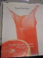
Look at those smooth, vivid colors, gorgeous. I see retired Stampin Up's "groovy guava" in that grapefruit juice ad.

Next, I want to show you what I did with the picture that I cut the three flowers out of for the card above. I continued to stamp and heat emboss as many of the flowers as I could on the picture as you can see in the next photo. This provides for more cards to be made now or later.
Now, if you notice, there is alot of gorgeous color left after we stamp all of the big flowers than we can on the picture. Well, I have a solution for this so that it doesn't go wasted. There is a smaller flower in that stamp set which we could stamp several times without the stem and make a bouquet of them to go on a card (I will post that one tomorrow - Wednesday).

Blessings, Lisa


Sunday, January 4, 2009

Trying Something New with a Summer Look


Hello. Wow it feels good to be back to blogging and paper crafting after that long Christmas break.

I decided after all of those Christmas cards that everyone has been posting on Splitcoast and on various blogs, that I needed to make something very non-Christmas-like. I have been wanting to try heat embossing on acetate. That sounds kind of scary, doesn't it? Yes, if you are not careful, you can melt the acetate, and it curls very easily at the very least.

However, the card on the left is an example of my first attempt at this idea. The photo doesn't show it clearly, but that cute stamp from Stampin Up's "Tart & Tangy" set was stamped in SU White Craft Ink, and heat embossed with SU's White Embossing Powder. It took me two tries to get it to look halfway descent. Let's talk about static! I am sure that you all know that acetate holds a lot of static. Well, I used the SU embossing buddy, and the embossing powder still held onto the acetate like crazy. I brushed off the excess with a paint brush very carefully. Now, a few spots still hung onto the acetate, so if this happens to you too, finish heating the embossing powder first. Then, simply scratch off the excess, and rub the areas with a facial tissue or a scrap of flannel fabric until the area shines again. But remember to be very careful not to scratch off some off the stamped image by mistake. This takes a lot of patience and is not a quick procedure in my opinion. But, in person it is a cool thing to see on a handmade card.

Supplies not listed above: SU Warmest Regards Sentiments Stamp Set, SU Whisper White, Only Orange, and Green Galore card stock, SU Only Orange Classic Ink, SU 1/16" Punch, 3/16" Corner Rounder punch, Silver Brad, Foam Dimensionals, Glue Dots, Michael's dollar bin ribbon.

While I was making this card, I began to think that it might also look good to place punched images on top of the acetate as well. It isn't quite as cool, but it looks good. So, that is where the next card came from. I was playing around with my Martha Stewart Seahorse punch again. I lo.......ve Seahorses. They are so different, and elegant to watch swim. Yes, I could stand for hours at our local aquarium, just staring into the Seahorse tank. Ok, moving onward.


This card is what I came up with. I first decided to keep it more simple than the first card, and decided to go monochromatic blue as well. So, the seahorses were punched and glued to the acetate with SU Crystal effects. It is hard to see in the photo, but I also tried to give them a little color by brushing their backs with a little SU Brilliant Blue Classic Ink, and of course little eyes with a Basic Black marker. I stamped "Thinking of you" on it, but it really could be used for birthdays as well. Well, I hope I have inspired you to get stamping again. I will list the supplies below, then "I am off like a dirty shirt".
Supplies on Seahorse card: SU Whisper White, Creamy Caramel, Bashful Blue, Ballet Blue, Brocade Blue, and Brilliant Blue card stock. Brilliant Blue Classic Ink, SU Warmest Regards Sentiments Stamp set, Crystal effects, Silver Brads, and Foam Dimensionals.

Friday, December 12, 2008

Something other than a Christmas Card


It is a little hard to tell from the photo, but I used the dryer sheet technique on this card. Stampin Ups Tart & Tangy stamp set just seemed appropriate for this card that I made last summer for a workshop. It made me think of all kinds of summer sweet beverages, with the oranges, lemons and limes covered with the dryer sheet and dazzling diamonds glitter. The glitter makes it look like it is covered with sugar.

I stamped the different Stampin Up colors randomly all over a sheet of 8 1/2" x 11" SU Whisper White card stock, so I could cut it into sections for more than one card if I wanted to. Then I applied some adhesive to the entire stamped section that I cut, laid down my dryer sheet, smoothing it out with my finger on top of the stamped images. Then I trimmed off the excess dryer sheet, and sprinkled the glitter all of the top of the dryer sheet, and rubbed in the glitter with my finger and tapped off the excess. Then finished the card as you can see in the photo. The green scallop piece was made using the SU 3/16" corner rounder punch with its removable base removed. That about sums it up. I am going out of town for the weekend, so I won't be blogging again until Monday. Have a blessed weekend.

Lisa

Sunday, December 7, 2008

Fun with Border Punches

Hello. Well, I haven't gotten the Stampin Up Scallop Border punch yet, but I have seen those too cute Scallop Border Punch Medallions that everyone is making over on Split Coast Stampers web site. I know that I am behind the game on this, but I decided to play around with my other border punches and the medallion thingy and see what happened. In the rare case that you don't know, the medallion is first started with a piece of card stock that is 2-3/4" square. Since the SU scallop border punch is manufactured by EK Success, I thought why not try other EK Success border punches, such as their own, or the ones that they manufacture for Martha Stewart Crafts. So, the first one is my EK snowflake border punch.


I love that little snowman from SU's "Merry & Bright" stamp set. I couldn't resist putting him on there.


This one is from the Martha Stewart Doily Lace border punch. I completely fell in love with it. Wouldn't it be adorable on a heritage scrapbook page border with an embellishment in the center? It would also be cute on an elegant card, especially wedding or shower.


This one is my absolute favorite so far, it is the "Double Arch Lattice" (I think) punch from MS.


Here is the one made with the MS Gingerbread border punch. I am not sure about this one, because the gingerbread people on the top will always have to be upside down. It is kind of cute, maybe you feel differently.


Next, I decided to get really adventurous, and try this with my Fiskers border punches. Not quite the same result. The Fiskers border punches are a bit larger, so the center fell out. This can be fixed by increasing the square card stock piece to be 3" square. I would like to say that I had a more difficult time getting the Fiskers punches through the SU card stock than I did the MS punches. The MS punches went through the SU card stock pretty smoothly.


Last, but not least, I wanted to show you the results of using the Fiskers leaf swirl punch. It makes a cute frame, but not exactly a punch medallion. Well, that is as far as I have gotten with this. I will try to put one on a card or a scrapbook page in the near future. If you have any other border punches besides the one I have shown, and experiment with them, send me an email and a photo, I am curious what others will come up with. Until later, hang loose, and be happy.
Lisa


Saturday, November 29, 2008

My First Diorama Card!

Hello. Its late and I can't sleep, so I decided to start a new post. I posted a little paragraph about my Nephew in the Navy a few days ago. I mentioned he was home from the war zones, well, I got to speak to him on the phone this evening. I was so excited to hear his voice. He is the son I never had. Ok, now that I expressed my awesome news for today, on to some crafting.

Well, at my upline workshop that I have been posting about all week, we made what is called a "Diorama Card". Yes I am sure that I was the only stamper left on the planet who had never made one before. I assumed something completely idiotic. For the longest time, I had been wondering how in the heck that you mail these 3-dimentional cards. Yes, just call me "ding-bat". Thank heavens my upline knows me well enough to say outloud as she is explaining how to make it, that it flattens down to be placed into an envelope, and pops back up when it is removed from the envelope. Duh! I was trying to picture this 3-D card being mailed in a small box, which to me seemed like a very big waste of postage. So, with that being said, please take a moment to laugh hysterically at me for being so dingy, then we can move on. .............................................................

Ok, so, here is the photo of the card. I am sorry, but I can't remember what Stampin Up set or sets we used, and don't feel like looking them up at the moment. Sorry about the bad attitude there. Now that I know how to create this interesting type of card, I will design one myself real soon and post it for anyone to see. If any of you want to learn how to make this card, there is a tutorial on a website called Splitcoast Stampers, which I am sure you have already heard of. If you haven't heard of it, the tutorials can be found under the resource heading at the top of the home page. If you are one of my local customers and want me to teach this at a workshop, just let me know, and we will get it scheduled!