Showing posts with label Spellbinders. Show all posts

Thursday, May 27, 2010

It's a Soft Pencil Customer/Design Team Blog Hop!!!

Yep, another Anniversary Blog Hop, for your entertainment and inspiration! Yay! Everyone needs ideas and inspiration. So, onward. If you wish to follow along with the blog-hop, the order and starting point can be found on the Soft Pencil Blog, which you can find here. If you are following along in the right order you should be arriving here from Betty's blog.

Now, we Design Team members were asked to use one of the new images this week called "Michu and the Big Flowers". It is super cute!!!! I got a new set of Spellbinder's dies a few weeks ago for Mother's day, and it is called "Label's Six", so I am finally putting them to use! Love, Love, Love them!!! Awesome Mother's Day gift! I printed my image out, to what looked like a good size for a standard size card, but then noticed that the largest die in the set was going to cut off one of my flower petals in the image. Oops! No worries though, I remembered a tutorial that I saw once (sorry I forget who and where), that would solve this problem. So, I put together a short photo tutorial for you. First notice the taller flower petals curled up just a bit. Then scroll down for the instructions.


What I did was to cut out the part of the image that was going to be effected by the die-cut with my x-acto knife. Yes, I know, tedious, but I studied Architecture in college so I am used to and enjoy detailed and tedious work.

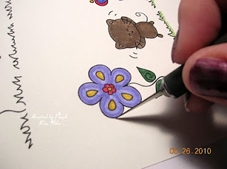
Notice in this next photo, the flower petals are cut and can be lifted up.


So, in the next photo below, I laid my die-cut onto the image where I wanted it, taped it down with blue painters tape (removes easily and doesn't damage). This way the die-cut doesn't shift while moving through the die-cut machine. Then simply lift the cut portions of the image over the edge of the die-cut. In this case it doesn't overlap by very much, but there are times, when a digi or stamped image can overlap by more.


Well, as you remember from the finished project photo above, all of the flower petals were cut and curled up. Well, I got on a roll and thought it would be fun to trim around all of the petals and curl them up just a bit. The center of the flower is anchored down with a small piece of Extra Tacky tape (find it at Stampin Up or Michael's), as cutting all of the petals left it hanging by a thread of card stock. That is all on the mini tutorial, if you have any questions, please feel free to email me from the link on my sidebar.

Now, as some of you may recall, on the first blog hop I chose to make a couple of cards with two animals from the "Animal's Collection". I made two cards, one with Michu the cat, and one with the Bunny, and if you browse my older soft pencil posts, you will see one made with Ratiny. Today, I decided to make one with the Giraffe. I thought it would make a great birthday card for a 2-4 year old child, they always seem to like zoo animals. So, here is what I came up with:


I really need to finish up this post as it is getting late, so if you have any questions about this second card as well, please feel free to email me.

Next on the blog hop is Soft Pencil DT Coordinator Kerry, who's blog can be found right here.


Until Next time.................. Blessings, Lisa

Thursday, January 21, 2010

Soft Pencil Thursday!!!!!!

It is Soft Pencil Thursday! Elizabeth, the owner of Soft Pencil, has created some new digi images and placed them in her shop and are they ever cute! Click on the Soft Pencil banner on my sidebar, and go check them out! Seriously, go look, now!!!!!!!

I was reading an article in a paper craft magazine, that purple and yellow are complimentary colors to work with. Well, me and purple, I had to try this out. The challenge we were given this week along with this verrrrrrrrrry cute image was to create a friend card. The image is called "Amy, Michu, and Ratiny". Wouldn't little Ratiny look cute all by himself on a card? I'm just sayin. What do you think, Elizabeth? Michu would too for that matter. Hmmm.
I used my Spellbinder's Rectangles to cut out the image and to mat it. I thought a polka dot roof with some patterned paper (Provo Craft) would be cute. The sentiment is from the Stampin Up set called "Teeny Tiny Wishes". The flower is unknown, sorry, it was in my "I don't know" stash. The purple gem for the flower center is from Michael's. The card stock colors used were Stampin Up's Lavender Lace, Lovely Lilac, Elegant Eggplant, and Crushed Curry. The image itself was printed out onto Watercolor paper as usual, but this time I colored the image with my SU markers instead of Ink refills. Why? I have no idea, just felt like it! lol.

Well, before I bore you any further, I will say goodbye.

Until next time.................Blessings, Lisa

Thursday, December 17, 2009

Soft Pencil Thursday - Mandala

Hello, it is another Soft Pencil Thursday. This is one of my favorite days of the week. This week we were asked to design something other than a card, with one of the Mandala digi stamps. I was assigned to my favorite Mandala digi that Elizabeth has in her store, it is called Eternal Flight. I swear that she must have ESP or something. Thanks Elizabeth, I had a blast coloring it. In fact, I had so much fun, I made two projects with it. I was so glad to have time to do that, so that you all can see their versatility.

For the first project, I altered a composition notebook. I decided that the image would be perfect for that purpose and I made it my prayer journal. This way, I can make notes when I am reading if I don't understand something, or if a particular verse or two stands out more than usual. Plus, I must confess (yes the pun is intended) that I thought that it might inspire me to read the good book more often.
I used Stampin Up markers and ink refills to color/water color the image. Here are the colors that I used: Certainly Celery, Regal Rose, Rose Red, Bashful Blue, Ballet Blue, and a combination of Brilliant Blue and Lovely Lilac to create the violet color on the butterflies. The fancy trim on the book binding was made with my new favorite Martha Stewart border punch, called Lattice. The ribbon, which serves as a book mark is retired SU Delphinium Grosgrain. Oh, how I will miss it when I run out of it! The butterfly accents were also made with a Martha Stewart Punch called "Butterfly Trio". I cut out my circles with my Creative Memories cutting system. The tutorial on how to put this whole project together can be found in the resources section of the Splitcoast Stampers website which you can find if you click here. See below for a close up photo of the Mandala.

The second project I made is a decorative element for my dining area that will hang on a shelf made for me by my grandfather. I got the idea to make this when I was browsing the dollar spot at Michael's craft store. I found a package of chipboard type coasters with different designs on them. I thought round....Mandala, gotta see what I can do with it. So, I printed the image out small until I came up with the size that I wanted. Yes, it took several tries. Oh well, it's only ink. I then, cut the image out with one of my Circle Nestibilities Di-cut, colored it with some coordinating colors to match my dining room, then mounted it on a slightly larger circle. Next, I traced the outline of the coaster onto some Bashful Blue CS, and cut it out. I applied all of this together with snail adhesive. The final touch was to punch a hole in the top and add an eyelet with my Crop-a-dile. I love that tool! Then, of course a loop to hang it with and a bow for decoration. The ribbon used by the way is Stampin Up Navy Grosgrain 1/4". The first photo below is a close up of the final project.
This next photo is just to show you what I started out with. The coaster that I altered is obviously on the right.

This final photo is one of the whole shelf that I am hanging the decoration on, it is over on the far right side.


I hope you enjoyed what I showed you today, and I hope you go visit the blogs of the other DT members, as they may have a different Mandala than I did and different projects. I know I can't wait to go browse them! As always, you will find links to their blogs over on my sidebar, and also a link to the Soft Pencil Designs Store.

Before I go, I just want to apologize for only posting one time over the past week. I am so incredibly busy getting ready for Christmas. I will try to post more between now and Christmas.

Until next time........................ Blessings, Lisa

Saturday, November 21, 2009

Pinky's Home

is the name of the digital image that I used on today's card. It was a freebie that Elizabeth over at Soft Pencil Designs offered over on Splitcoast Stampers website. By the way, thanks Elizabeth.


I decided to step away from the traditional card fold, and make a gate fold card, which I haven't done in quite awhile. With the help of my handy Scor Pal tool, it is very simple to do. I colored the image with my Stampin Up markers, cut it out and added it to a scalloped square mat that I made with a Spellbinder's Nestibility di-cut. I think you can tell in the photo, that it is attached on the left side of the card, with some foam dimensionals to pop it up just a bit. Some sticky gems from Michael's dress it up a little, and the DSP on both side panels, is from Stampin Up. The border fence at the bottom was made with a Martha Stewart border punch. The card stock used was Stampin Up Whisper White, and Pale Plum. The butterflies at the top were also made with a Martha Stewart punch. I think that sums it up.

My nephew is home visiting from San Diego where he is stationed in the US Navy. I am so proud of him, so I will be back to blogging after the weekend is over.

Until next time...................Blessings, Lisa


Tuesday, November 3, 2009

Blue Birds

Hello. I have been so busy, and I have a feeling life is not going to slow down until after the holidays. I did manage to make a card to share with you. I have been playing around with some of my digital images, and here is what I made with a new digi image from McMahon Five Designs.


Aren't these two birdies adorable? I couldn't resist them. I printed them out on Canson 90lb Watercolor paper, and colored them with my Stampin Up Markers. I usually use 140lb watercolor paper like what Stampin Up sells, but I was afraid that it was too thick to go through my inkjet printer, so I am saving the heavier stuff for use with regular stamps. I cut the image out with some Large Oval Nestibilities, mounted on a Scalloped Oval Nestibility. The card base is Bashful Blue, the DSP is from one of the Stampin Up Hostess 6x6 DSP pads, the blue sticky gems are from Michael's, the flower is from Prima, and the sentiment is from the Stampin Up Hostess Level II stamp set called "Kind and Caring Thoughts". I also sponged around the edges of the image oval with Bashful Blue ink. It looks more prominent in person. I have a little icon over on the right side of my blog for McMahon Five, if you want to see this image and others, just place your cursor over it and click, and it will take you to their store.

Until next time............... Blessings, Lisa

Monday, September 21, 2009

Christmas cards Stampin Up style

I have two cards to share with you tonight. When I first saw the new Stampin Up catalog this past summer, I completely fell in love with the stamp set called "Gifts of Christmas". Despite the fact that I have at least a half a dozen Christmas stamp sets, I just had to buy it. I am sure you all know how that is, right? Then, I received my Holiday mini catalog, and was hooked once again on almost everything in it. So, I placed my order and one of the things I ordered was the new Sizzix Textured Impressions Embossing folder, called "Petals a Plenty". Oh and lets not forget the new shimmer paint. If you have been following my blog for awhile, you know that I simply adore anything that shines, shimmers, or sparkles. Love my bling! So, this card idea popped into my head and it has alot of shimmer on it. Shimmer paint, shimmer card stock, shiny embossing powder. Yep, gotta have some shimmer! Ok, I will quit blabbing and show you my stuff; so to speak.


The card base is Stampin Up's Handsome Hunter, the embossed panel is Real Red card stock, and is accented with the Platinum Shimmer Paint in the SU Holiday Mini catty. Basically, as you can see it is Silver Shimmer paint. It is hard to see, but the image is stamped on SU Shimmer White card stock, heat embossed with Silver embossing powder. I heat embossed the image a second time, and cut out the dove, so that I could pop it up with some dimensionals. It s hard to see in the photo, but I used different a thickness of dimensionals at different places on the dove, to give it a little different look. There are two ways to achieve this, either buy your dimensionals in two different thicknesses, or simply layer your stampin Dimensionals on top of each other. Layer two together where you want your image to be higher, and only one where you want it to be lower. I have an enlarged photo below to show this better. See how the center of the wings are higher than the tips of the wings. Trust me when I tell you that it looks way better in person.


The image is also matted on some Stampin Up Silver Shimmer card stock. The next card involves the smaller image of the same stamp set. I had cut my embossed Red piece into two different sections, so I put my thinking cap back on and decided on the card layout below to use the other red piece. It is basically the same layout, but inverted in the vertical direction. All of the supplies are the same except a couple of embellishments and cutting tools. I used my regular and scalloped Spellbinder's Rectangular Nestibilities to cut out my stamped image, which is popped up with some dimensionals. I added some Silver Faux pearls to each corner, and a white bow down at the bottom to balance out the card layout.

I hope you like what you see.

While I still have your attention, I have got to tell you about something that I ate at a wedding reception over the weekend. We were served a plate with a piece of roasted chicken stuffed with something, white rice cooked in chicken broth, and buttered cooked asparagus. Keep in mind that I am a plain ordinary food kind of person. This was my first time trying asparagus, and I am happy to report that I liked it. Now, this chicken stuffing stuff was pretty darn tasty, so I asked our server what ingredients were in it. She said she would ask the chef. After a few minutes, she came back and told me about some ingredients that I would have never guessed and certainly would not have purchased at the grocery store. They were: Spinach, Sweet Red Peppers, and the biggest surprise.....Goats Cheese! First, I hate spinach and sweet red peppers, and just the thought of trying Goats Cheese would have made me hurl had I known this before I ate it. So, now all I can do is laugh, because dog-gone it, that stuff was absolutely positively fabulous!!!!!! Broaden your horizons this week and try something out of the ordinary to eat, ya never know what you might like!

Keep Stamping...................Blessings, Lisa

Tuesday, September 1, 2009

Clean and Simple Birds

Today I have a couple of Clean and Simple cards to share that I made with the Stampin Up Level One Hostess set called "Of the Earth". I chose to use the bird stamp from that set today.

The first card as you can see is purple. Imagine that! Purple on my blog, what else? Anyways, the card base is Stampin Up's Almost Amethyst, the image is stamped on Whisper White with Elegant Eggplant ink; and it is layered on Elegant Eggplant card stock. The image was cut out with my 1-1/4" square punch, and the mat was cut with my 1-3/8" square punch. The embossed square around the bird was made by running one of my Spellbinder's square nestibilities through my cuttlebug with a tan embossing mat, instead of cutting plates only. This was my first try with this, but not my last, I love the result.


This one was actually even easier than the first, as I simply stamped the image 3 times with each color,and punched then out with the 1-1/4" square punch and their mats with my Stampin Up Scallop Square punch. The colors used for this card are Stampin Up Bermuda Bay, Crushed Curry, and Whisper White for the card base. I hope you liked them.
Until next time.............................. Blessings, Lisa

Monday, August 31, 2009

Wild Things from The Greeting Farm

Hello. I hope all is well with all of you! I have been suffering from headaches from the lovely weather changes here in Ohio. However, I am still stamping. I have a couple of cards that I made with stamps from The Greeting Farm stamp company. Click on their name for a link to their store. You will also see a link to their blog on my sidebar. They have the most adorable stamp images/sets. They are definitely one of my favorite stamp companies. Ok, on with the cards:


The first card above is the lion image from their "Wild Things" stamp set. I was playing along with a challenge to make a circus themed card, and I though the Lion would be perfect. So there he sits on the podium roaring to the crowd. The podium was made with my Stampin Up Round Tab punch cut in half. The balloon bundle was made with the bunny and balloon stamp from TGF Lucky bunnies stamp set. I simply inked only the balloon three times, colored them and cut them out. The rectangle that the lion is on was cut with a Spellbinder's Large Rectangles Nestibility. The little popcorn embellishment was from A Sandilion Sticker Circus set from my stash, and the little stars were punched with a small star punch from Michael's with foil card stock .


I had a blast making this card too. I was looking at the monkey image that I had previously water colored, and the sentiment "swing at it" from the same "Wild Things" stamp set, and thought to myself that this monkey just had to be hanging from something. The vine that he is hanging on was cut with my SU Little Leaves die, and the other vines were made with my Creative Memories 12" curvy trimmer. I was going for a Clean and Simple Card on this one, so swinging monkey and his jungle vines were as far as I decide to take this. The leaves on the other vines were cut off of the die that the monkey is hanging on. The circle and its scallop layer are once again Spellbinder's Nestibilities.

Have a great Monday and until next time............... Blessings, Lisa

Wednesday, August 12, 2009

Snuggle with The Greeting Farm


Hello. I am working on some new things to show you with my Stampin Up Mini Catty stuff, but While I am finishing that, I have a card made with a stamp called "Snuggle"; from The Greeting Farm stamp company. Is she cute or what? This is actually my first card made with her. Of course I had to color her hair a medium brown to look like my daughter. Of course she also had to be dressed in Purple. Anyways.... I stamped her onto some watercolor paper with Versamark and black embossing powder. I then water colored her with some of my Stampin Up inks, watercolor wonder crayons, and my blender pens. Then I cut her out and set her aside for two weeks or so. I get in these coloring moods, so I color a bunch of images, and set them aside for later. Putting the card together was pretty simple. The DSP is Basic Grey, and the card stock base is unknown from my stash. I cut the quarter circles after I ran a Spellbinder's circle through my Cuttlebug, the image is mounted on some rectangles that I also cut with my Cuttlebug and some Spellbinder's dies. The ribbon is from American Crafts, the flowers are from Prima (what else?). Finally, the Faux Pearl accents are from Michael's. Oh, I have an enabler alert: If you like to use sticky faux pearls and gems on your projects, Michael's is expanding this section of their stock! Lots of new colors!


Until next time.......................... Blessings, Lisa

Wednesday, July 29, 2009

Patience From Whimsey Doodles

Is who this little girl on my card is. Her name is Patience, and she is a digital image stamp from Whimsey Doodles online stamp company. A link to their store and blog is on my sidebar if you want to see more of their cute images. I printed Patience out with my ink jet printer onto some Georgia Pacific card stock that can be purchased at Wal Mart in the office supplies section. The reason that I didn't use Stampin Up's Whisper White, is that the ink jet printer ink smears on that card stock when I am coloring a digital image. So for digital images only, I use the GP card stock.

You all know that I like Purple, so here is Patience in purple:


Is she too cute or what? After I printed her out, I colored her with my Stampin Up markers and blending pens, then cut her out and placed her on a square cut with a Spellbinder's large square nestibility with SU Almost Amethyst card stock. She has a bit of SU Elegant Eggplant punched with the scallop edge punch sitting behind her. The purple flowered vellum paper under her is from my unknown stash, and the sentiment is also from Whimsey Doodles from their "Button Sentiments" set; which I adorned with a satin Prima flower, DCWV button, and some EK Success purple fibers. That about sums it up. Feel free to contact me if you have any questions, and have a great week. I'll be back soon. Blessings, Lisa

Tuesday, July 14, 2009

Purple Flower

Hello. Well, as most of you know, I love the color purple. So, I couldn't resist making a purple card, it has been awhile since I have done this. It is still in the somewhat simple mode, so It should be easy to case. I hope you enjoy it.

The stamp set that I used was once again Stampin Up's Hostess Level 3 set called "Kind and Caring Thoughts". This a big stamp set with several image stamps and 3 short sentiments, and a handful of verses that would work great for the inside of your cards. I began by stamping the flower image onto my Versamark pad, then onto a Lavender Lace Classic ink pad, then with a sponge dauber, I stamped the edges of the flower with some Elegant Eggplant classic ink, then finally stamping the flower onto some Whisper White card stock. Next I sprinkled some Iridescent Ice embossing powder on the flower and heat set it. I apologize, but you can't really see the sparkle on it in this photo. I hate it when that happens, but sparkle is hard to catch in a photo. Next I cut out the flower with one of my Spellbinders Large Oval Nestibilities, and mounted it onto another oval (Elegant Eggplant) made with a scalloped oval nestibility. Next I cut out a wide strip of Lavender Lace card stock, scored it a few times to give it a little dimension, tied a piece of 1/4" Eggplant Grosgrain ribbon around it, punched the bottom of it with my SU scalloped border punch, and mounted it with some foam pop dots. The last things that I did was to mount the flower with some foam pop dots and add a few faux silver pearls just for the heck of it. If you have any questions, you know where to find me.
Blessings, Lisa

Wednesday, June 24, 2009

Faux Mosaic Fish

I saw an interesting technique on Splitcoast awhile back and have been wanting to give it a try. It is called Faux Mosaic, and it allows me to use some card stock scraps that I save in my altered heart box (see category list on the side bar for that one). I have this habit of saving absolutely anything that I think may be useful, yes I am a "pack rat", tis inbred in my immigrant genes on both sides of my family. Anyways, here is the card, and I used the stamp set "Ocean Commotion" from Stampin Up.


Here is a photo of just the mosaic pattern:


I think the easiest thing would be to just list by number the steps involved in making this:

  1. The first thing that I did was to gather scraps out of my box that were all in the cool blue colors. On this card I used Night of Navy, Ballet Blue, Bashful Blue, and even a few of the retired Bliss Blue all from Stampin Up.
  2. Next, I cut the ones whose shape that I didn't like.
  3. After that, I cut a base for the mosaic to a size that I liked.
  4. I cut a piece of Stampin Up's double sided sticky sheets to the size of my card stock base, and adhered it. Remove one side of protective sheet, lay it on the card stock, smooth it out, then remove the other side to expose the other sticky side.
  5. Place card stock scraps onto sticky sheet in any random positions that you like, leaving space between each one.
  6. Sprinkle embossing powder over entire mosaic piece. Shake off excess, and heat set. I chose to use silver EP here.
  7. Take your Versamark pad and apply it to the mosaic piece directly over and over until the entire piece is covered.
  8. Sprinkle clear embossing powder over entire mosaic piece, shaking of the excess.
  9. Heat set. That part is done.

Now for my Fish image! I stamped the image onto my Versamark pad, then onto an SU Ballet Blue ink pad, then kind of rolled the edges of the stamp on a Classic Night of Navy ink pad. I got a little more Navy on here than I wanted, but oh well. This part is called the "Rock and Roll" technique. Isn't that just like me to combine two techniques on one card just to be difficult? Next, I stamped the fish onto some Whisper White card stock, and added some clear embossing powder to it and heat set. Heat embossing? Oops, that makes three techniques on one card. Sorry ...my bad. Next, I cut out the fish with a square Spellbinder's square nesties die-cut , left the image in the die-cut while I sponged some ink around the edges so I would leave that nice white border around it. Next I cut a mat for the fish with a larger square nesty. Then for a little extra effect, I drew some bubbles with my Sakura Micron pen which can be found at any Michael's store. Phew, that was a long post, I hope I didn't put any of you to sleep.

Now, to close, I want to share a photo of my too sweet miniature Doxie, after my daughter dressed her in a doll blanket. Poor dog! She shook that little old body of hers for a few minutes to get herself free of it.


Thursday, June 11, 2009

There is a Cute Little Mouse...

on the card that I made today. When you see her, I think you will agree with me.

See what I mean, isn't she cute sitting there in that little teacup? Setting aside my water coloring of course, she is just a too cute image to work with. She is part of a stamp set called "Cup of Stuff" from The Greeting Farm Stamp Company. You would think I were working for them with all of these cards that I made from only 2 different stamp sets, but no, I just love their stamps. Anyways, the card base is Stampin Up Ballet Blue, the 3 strips of patterned paper are from a retired pack of SU DSP. I stamped the image two times onto watercolor paper, so that I could cut out the one that I water colored and pop it up with foam dots. I water colored with Stampin Up Classic Ink and blender pens. The base that the mouse is on was cut with a Spellbinder's Nestibilities rectangle, and the mat with a scalloped rectangle. The sticky gems are from Hero arts, and the card layout is this weeks card sketch over on Splitcoast Stampers. Here is a photo of the layout. It is so versatile, it will definitely get used over and over in my crafty world.


Until next time..........Blessings, Lisa

Thursday, June 4, 2009

Bunny Birthday Card

Hello. I had another card made from The Greeting Farm stamp company lucky bunny set, so I thought I would share it. Here she is and holding a birthday present.

I started out like the other Bunny card stamping her two times on water color paper, then water coloring one of the bunnies and cutting it out. The plain bunny was cut out with a Spellbinder's Nestibilities rectangle, then mounted with foam pop dots onto a Nestibilities Scalloped Rectangle. The present is sparkly because I added Stickles glitter glue to it. The next thing that I did was to adhere the colored bunny on top of the plain one with foam pop dots. The frame around the bunny was made by running a scalloped and a plain nestibilities rectangle at the same time through my cuttlebug. I also ran them both through with some water color paper to ad to the back of the frame to make it stronger. The rest was pretty easy, I created a border with some DSP and some ribbon, then added the Prima flowers for embellishments. I gotta go for a bit, but I will be back to list the remaining supplies.

Saturday, February 21, 2009

St. Patrick's Day Blessing

I know that I am early with the St. Patty's day stuff, but I can't help myself, because I am trying to rush into Spring. However, the weather in Ohio is not cooperating with my wishes. It warmed up some and then "BAM" hit with 28 degree temperatures. My daughter and I have been coughing and dealing with sinus drainage for several days. So, if I am in a hurry for anything Springish, can you blame me? So much for Global Warming! Hahahaha! Ok, on with a card!

I found this very sweet St. Patrick's Day blessing on the internet, so I copied it into a word document, played around with the font style and color a wee bit, and then printed it out onto some Stampin Up Very Vanilla card stock. I then cut it out with a large rectangle Spelbinder's Nestibility, and mounted it with foam dimensionals onto some Stampin Up Garden Green card stock that I cut out with a Scalloped Rectangle Nestibility. I just can't seem to quit using my die-cuts and Cuttlebug machine this week. Anyways, next I punched out some small shamrocks with an EK Success Paper punch and adhered them below the sentiment. At this point, I set it aside for several days because I got stuck. Don't ya hate it when that happens? So, this evening it kind of fell into place. I had some shamrock DP (from Provo Craft) leftover from my previous card, so I laid that down onto some SU Certainly Celery card stock, and adhered the sentiment with some foam dimensionals. The corner accents were made with cuttlebug's antique corner die-cuts and some SU Very Vanilla


cardstock and popped up with dimensionals also. The ribbon is some retired SU Wild Wasabi double stitched. The bow is entirely held together with the sparkly brad in it's center. The brad is from Michael's Recollections collection. They had them on sale a few weeks ago and are so gorgeous.

I think that covers the instructions, if not leave me a comment or email. Actually, leave me a comment even if I did explain it all. Tee Hee. Am I begging for attention, or what? Yes I am and not a bit ashamed of it. Ha ha.

Anyways, have a great weekend and blessings to all everyday, not just on St. Patty's day.

Lisa


Thursday, February 19, 2009

Blue and Pink Versions of Butterfly Card

Hello. Well, as promised I finished the blue and the pink versions of the butterfly card on my previous post. I love how the blue one turned out, but not so much the pink one. But hey, we are all our own worst critics. So, here are the photos:

The colors used on the blue one are Stampin Up Brilliant Blue, Ballet Blue, Versamarker and Clear SU EP on the large butterflies. The sentiment is a stamp from Studio G series 6 and stamped in Craft Brilliant Blue ink, the sticky gems are from Michael's and so is the blue ribbon, and the brads on the ribbon are blue Rhinestone Brads from Stampin Up.


The colors on the pink card are Stampin Up Pretty in Pink, Regal Rose, and Rose Red. I used Versamarker and Clear EP again on the large butterflies. Same


sentiment as before except in Rose Red Craft Ink from Stampin Up. The sticky gems are again from Michael's, the ribbon is from Stampin Up (Rose 1/4"), and the silver brads are also from Stampin Up.

To find out what tools were used, please scroll down to my previous post showing the purple version of this card.


Before I go, has anyone seen the new Martha Stewart Easter Bunny Border Punch yet? Yes, I am obsessed!


Ok, Until next time............Have a great Friday and keep stamping!


Blessings, Lisa

Monday, February 16, 2009

Purple Butterflies

Hello. Sorry for my long absence; I have been busy with some important personal things. Now, Spellbinder's is having a card contest over on Splitcoast Stampers website. Apparently, they will be choosing the winner by the random integer method rather than choosing their favorite creation, so I thought I might as well show you the card I am entering since it will be visible on Splitcoast as well. I decided to go monochromatic, as I love that look; and I also started a pink and a blue versions of this card as well. I will post those as soon as I finish them. So on with the purple version!

So, what do you think? I love purple, and butterflies, so I love it! My second favorite color is blue, so I am anxious to finish that one as well. So, the large butterflies and the labels below are from Spellbinder's Shapeabilities collection. The rectangle and the scalloped rectangle are from Spellbinder's Nestibilities collection. Their die cuts are on the expensive side, but if you use the Hobby Lobby 40% off coupon, or a couple of websites I will post links to at the bottom, you can save some $$$$$$$. The great thing is that you don't have to buy their Wizard die cutting machine. Their die cuts work in both the Cuttlebug machine and the Sizzix/Stampin Up Big Shot machine.

Back to the card........ All card stock is Stampin Up, and everything is popped up with foam dimensionals. The large butterflies, had some areas that get dry embossed while they are being cut, so I colored those areas with my Versamarker, and heat embossed them with some Stampin Up Clear Embossing Powder, then did some tone on tone sponging with SU classic ink on their edges, all to give the die-cut shapes a little dimension. I also sponged the edges of the plain white rectangle, and white sentiment label to add a little interest onto those as well. See the complete supply list below. As always, feel free to ask me questions if I didn't give enough detail on the card. I promise to answer all comment questions, or emails.

Blessings, Lisa

Supplies Used:
Card stock ~ Stampin Up Whisper White, Elegant Eggplant, Lavender Lace, Almost Amethyst.
Ink ~ Stampin Up Classic Almost Amethyst, Lovely Lilac, Craft Elegant Eggplant.
Accessories: Stampin Up Clear EP, Eggplant Grosgrain Ribbon and Rhinestone Brads; Hobby Lobby Lavender sticky gems, Martha Stewart Trio butterfly punch (small butterflies), Nestibilities Large Rectangle and Large Scalloped Rectangle die cuts, Shapeabilities Butterflies and Ribbon Tags Trio die cuts.

Spellbinder's Die cuts purchase tips:
Marco's Paper in Dayton, Ohio has them on sale right now and can be purchased off their website.
U Cut at Home, an online store has a VIP 40% off coupon that you can sign up for and they email a coupon code to you. I have noticed that you have to re-sign up each month if you want the coupon. However, you do not have to re-create and account each month.

Tuesday, February 10, 2009

St. Patty's Day Card

Hello. I was in the mood to make a wee St. Patty's Day card. I started it two days ago or so, put it down, then the creative juices began to flow again this evening. So, here it is:


I saw this cute patterned paper on clearance at my local Michael's store, and decided that I had to have a sheet of it.

Speaking of Michael's, I have been literally stalking that place waiting on them to get the Martha Stewart Easter Paper crafts stuff in. There are plenty of other Easter crafts in, but no Martha Stuff. My good friend Lydia Fiedler was fortunate enough to go to Winter CHA a couple of weeks ago, and saw all the latest goodies coming to stores for the paper crafting industry. She has a photos on her blog covering this event, and one of them was of a Martha Stewart Easter border punch. I HAVE GOT TO HAVE IT! So, if any of you happen to see it hit the stores, send me an email, or leave me a comment. I would greatly appreciate it, and may even reward you for it!


Ok, back to the card. So, the patterned paper is by Provo Craft, the card stock is all from Stampin Up. The shamrock was made with the heart stamp from Stampin Up's retired Mini Medleys stamp set, and the stem was created dabbing a small paint brush onto my SU Garden Green Craft Ink pad. Then I heat embossed the shamrock with SU Clear EP and cut it out. I am so hooked on heat embossing. The rectangle layers were made with my Nestibilities large rectangle die-cuts. All of the layers are popped up a wee bit with foam dimentionals.


Supplies Used:
Card stock~ Whisper White, Garden Green, Certainly Celery
Ink~ SU Craft Garden Green
Accessories~ Hero Arts Light Green Sticky Gems, SU 3/16" Corner Rounder punch
Sentiment ~ Unknown

As a closing comment, I would just like to say:


Wherever you go,
Whatever you do,
May the luck of the Irish
Be always with you!


Even if you aren't Irish!


Blessings, Lisa

Friday, December 26, 2008

A Card Made from Leftovers

Hello. Ok, not all the pieces of this card are leftovers.

The Royal Blue (SU Brilliant Blue) piece is leftover from another card. Keep scrolling down, and clicking on older posts at the bottom to find it. The little butterflies are left over from another project (Martha Stewart Trio Butterfly Punch). The Brilliant Blue and the Center pieces are popped up with foam dimensionals. The white piece below was run through my Cuttlebug with the Swiss Dots embossing folder, and the base of the card and the center piece are SU Bashful Blue card stock. It is hard to tell in the photo, but the stamped image is heat embossed with SU Clear embossing powder. I first stamped the images onto my Versamark pad, then stamped the images onto the SU Classic Ink colors that I wanted, then stamped the images onto the card stock so that I could add some clear embossing powder and heat emboss. Heat embossing is kind of an obsession with me these days. The bow was simply adhered in the middle with a foam dimensional, and snail adhesive on the back of the white section. Oh, there is Stickles covering the butterflies too even though you probably can't see it in the photo. I will add a close up and see if that helps.

Supplies:

Stamps: Stampin Up Retired Wee Watercolors Ink: SU Classic Brilliant Blue, Always Artichoke, Versamark Card Stock: SU Whisper White, Brilliant Blue, Bashful Blue. Accessories: Spellbinder's Nestibilities Large Scalloped Ovals Die Cuts, Cuttlebug Swiss Dots Embossing Folder, SU Clear EP, MS Trio Butterfly Punch, Foam Dimensionals, Unknown Organdy Ribbon.

Monday, December 22, 2008

Playing Around with my MS Sea Horse Punch


Hello. My fabulous husband, knowing of my love for seahorses, bought me a Martha Stewart Sea horse punch. So, I felt the need to play with it a little. In case you have never seen it, there are two sizes of seahorses that this particular punch makes each time. So, I punched a few out with some Stampin Up Creamy Caramel card stock, and brushed their backs with some Versa Color - Bark ink and a black dot for their eye. Next, I free-hand cut some seaweed out of some iridescent green vellum paper that I had in my stash. Next I cut a rectangle out of SU Bordering Blue, and matted it onto Night Quite Navy. Then I just pieced my items together where I liked them with some dotto re positionable adhesive (just in case I wanted to change my mind). Then, I had a verse stamp that I wanted to use, but it was kind of large, and I only wanted to use part of it. So, I typed on Microsoft Word, and printed it out onto SU Bordering Blue Card stock, and cut it out in a rectangle shape. Then I secured down my easy ribbon loop (quicker than tieing a bow). Next I popped up the saying over the ribbon with some foam dimensionals, and decided I was done. Until.........I saw a bottle of Stickles (diamonds) sitting on my shelf. What a fiasco adding the stickles was.

You are going to think I am a big Ding Bat when I tell you what happened. I have never used Stickles before, but thought I might give them a try since practically everyone else in the card making world uses them. I squeezed that little bottle really hard hoping to place a little line of sparkle along the sea horse's backs. Not one drop nor sparkle would come out. So, I gave the bottle a look over, and found nothing wrong. So, "What Gives" I am asking myself and the bottle. After all, I probably paid a whole $1.99 for this .5fl.oz. bottle of sparkle, darn it I want it to work! So I thought maybe if I snip off a little bit of the tip to make it a tiny bit wider; it will work for me. OOPS! I cut too much off! A big blob came out of my stickles bottle, drowning my poor seahorse! So, I decided to keep things consistent, I drowned all of the seahorses, and carefully smeared the stickles around covering their whole body. It turns out that I liked the final result of this blunder, and I hope you do too!